Fantastic Divine and Thrillingly Bright I
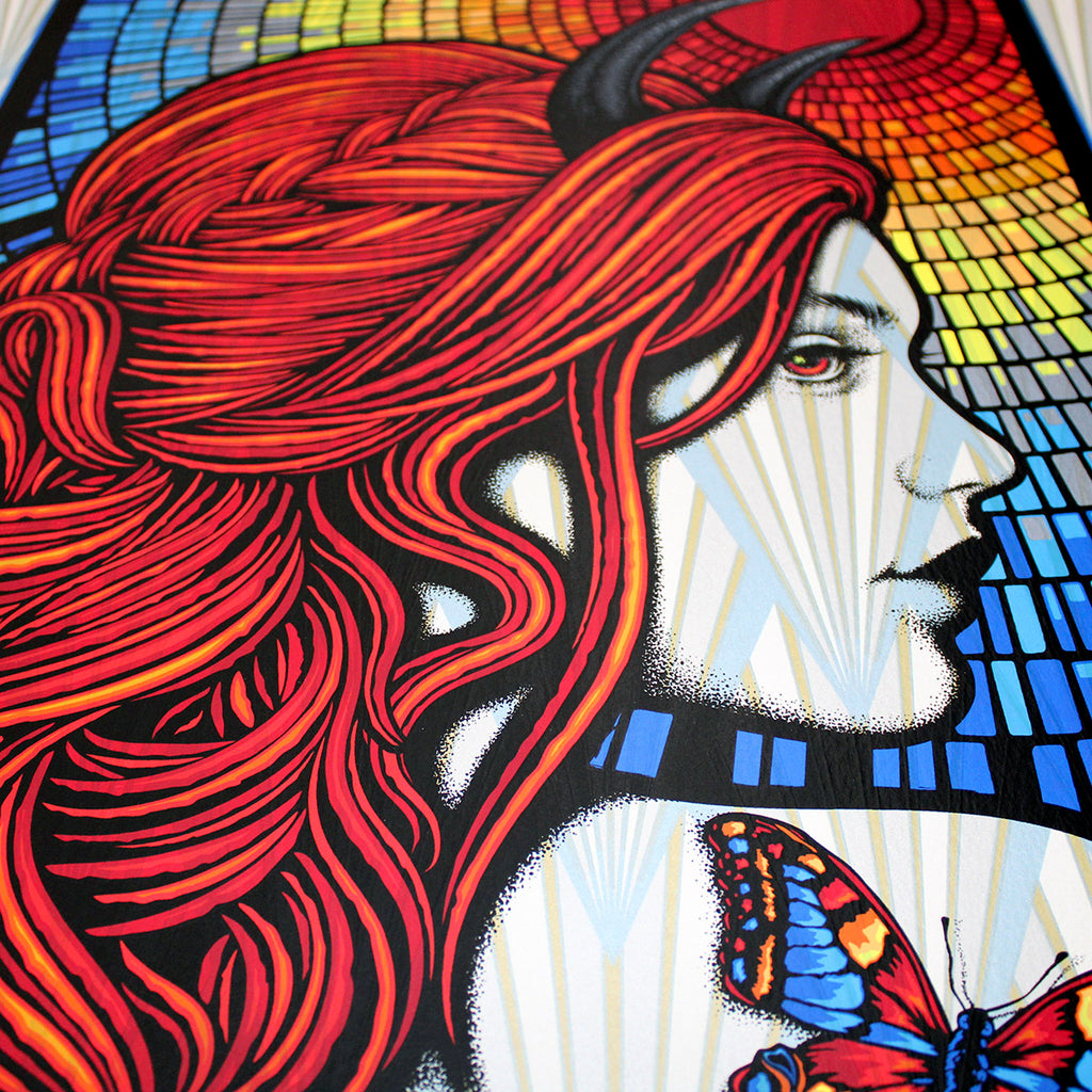
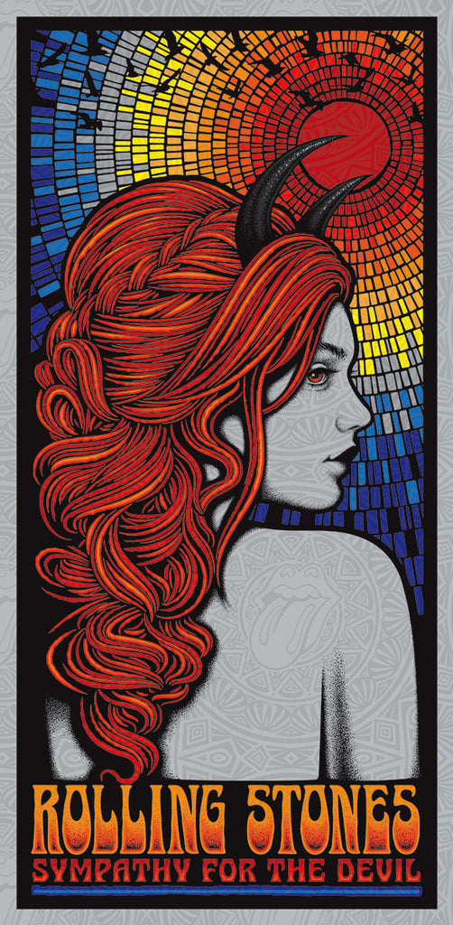
Welcome to a 2021 edition of: story time with Slater. At the start of this year I was approached by my friend Jermaine Rogers to participate in a series of fully licensed rock and roll prints through Echo Print Gallery. The two of them had done all the legwork and secured an impressive roster of licenses with many of the world's greatest bands. Among those is the Rolling Stones! I've always wanted to do something for them and after 17 years of making art for musicians the opportunity finally arrived. As I agreed to the gig I stared at a John Seabury 'Sympathy for the Devil' print that hangs in my office. I knew then that the sixties era of the Stones would be my focus. After a month of work I sent the final piece off to Mick Jagger for approval. I anxiously awaited a response and after a week we got one. I hopped on the tele with Jermaine to discuss, but the news wasn't what we'd hoped for. Mick was a gentleman of the old school, he was gracious and complimentary of the work but it was not meant to be. In fact, all of the art made from a variety of artists for the Stones was put on ice. After talking things out I believe they are focused more on 2021 than the sixties and I understand that. What can I say though? I took a shot and sure as hell would do it again. I may try something else for the guys down the road. I'm not done playing with fire and Jagger hasn't heard the last from me.
.
What happened next ended up being the best thing that could have happened to the art.
.
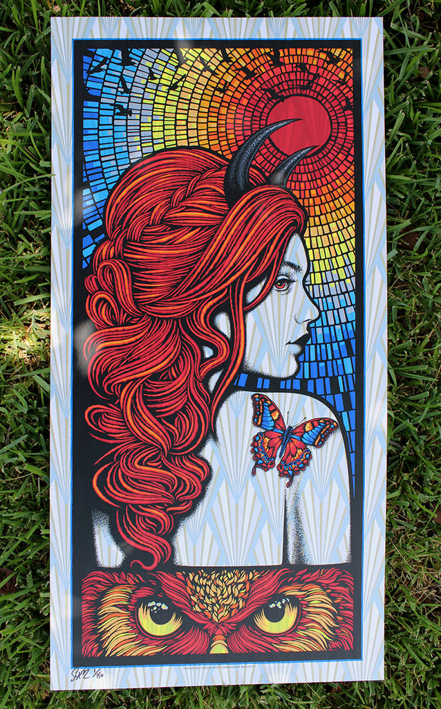
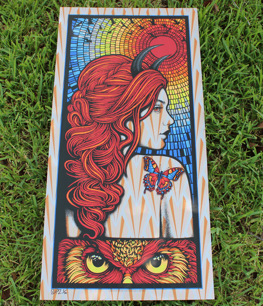
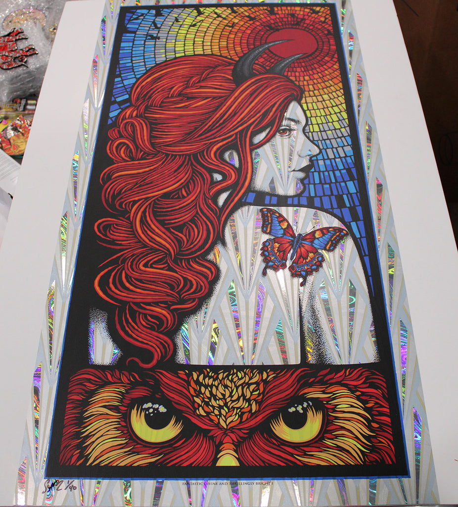
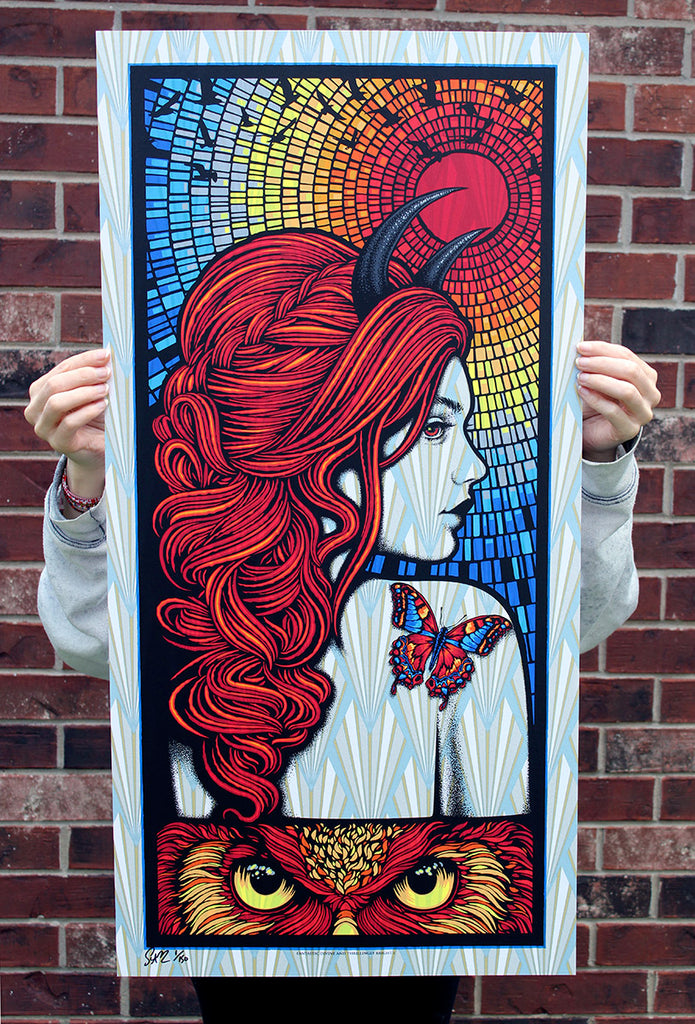
A month passed while I worked on other projects. I had zero interest in trying to re-tool it for another band. What did feel right to me is the core of the image and the art itself. I decided to go forward with an art only version and began revising and redrawing the imagery. After that, the art took on a life of its own. As I continued to work on it I kept adding color. I think because I no longer had any parameters or constraints the color really started to blossom and grow. A vibrant butterfly emerged resting on her shoulder to complement the mosaic swirl. I replaced the text with an owl's intense stare. The idea here is to represent a range in her feelings and moods. It fluctuates between an owl's ferocity and the luminous glow of the butterfly. Then I extended the blues several inches at the bottom and drew a three color art deco style fan pattern to add some touchability and texture to her skin. By the end of the lengthy revision a rainbow of color had appeared and I ended up with a whopping 15 screens; the most I've ever used by a wide margin. And, because the project no longer had parameters or restrictions or a budget I decided to make the print large at 18x36 inches. And every copy had to be printed on specialty celestial shimmering paper stocks. Lastly, I settled on the name of the print: Fantastic Divine and Thrillingly Bright I. The phrase comes from a Robert Smith lyric from the Wild Mood Swings album. That record is also where the reference for my 'Strange Attraction' series comes from. In the end the art evolved into something I couldn't have predicted. Having seen these in person I feel they are the most ambitious thing I've ever printed. 2021 may be the year of the rainbow for me. Here's hoping this is the first of many in the Fantastic Divine series.
.
NOTES: 18 x 36 inches /// 15 screens on specialty paper stocks with metallics and varnishes throughout /// edition signed and numbered to 150 /// foil editions (Wind Chimes & Lava) are signed and numbered to 40 /// various Stardream papers signed and numbered in editions of 10